HEATH CAREFOUNDATION ofTHE ORANGES.
website
& development
The Healthcare Foundation of the Oranges’ (HCFO) goal was to use their website to target two distinct groups within their community: (1) the groups and individuals aiming to improve the overall health of the community; and (2) those in the community in need of assistance. With that in mind, we set out to create a website design that allows both groups to easily get their information without making it appear that one group is more important than the other.
THE APPROACH.
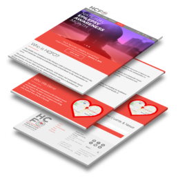
We created a website design that lived up to the challenge while utilizing some of the fun elements from the new HCFO identity system we previously created.
Bright colors and photographs help break up the text into easily digestible bites. A few other fun flourishes are sprinkled throughout the site.
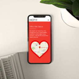
- A heart shaped live-map framing the community served by the HCFO was one of the more technical stand-outs.
- Using a live Google Map helped us give better context in identifying areas being served.
- Simple animations give quick and helpful feedback to users after they tap, hover, or click an interactive page element.
USER EXPERIENCE.
With a target demographic being communities in need, we targeted low-end, and older phones on slower 3G networks when it comes to the design and performance of the site. A mobile-first approach usually makes the most sense, but it was especially crucial with this target audience in mind as the low tech specs influenced a few elements during the design process, namely with regards to which typefaces we would use. Overall, it’s commonplace for us to think mobile–first, but we paid a bit of extra care this time around.
A Site For All
Accessibility is always top of mind with us, and was also the case for this client. Serving a diverse community, we all wanted to make sure everyone who needs this information, has access to it. With that in mind, we added the ability to translate the entire site to the user’s language of choice.